


Info
Some brands feel effortless yet deeply considered, and that’s exactly the space Emmi Smith wanted Emmi Collective to occupy. As a design studio rooted in interior spaces, the challenge was to create an identity that felt referential yet contemporary—drawing from art, design, and nature without ever feeling overly conceptual.
Through close collaboration with Emmi, a clear direction emerged: a balance of refined aesthetics and liveable warmth. This duality informed every brand decision, from typography choices that bridge tradition and modernity to a visual language that feels as much about instinct as it does about precision.
The typography reflects this approach, balancing sculptural letterforms that bring a sense of heritage and sophistication with a softer, more humanistic counterpart that introduces warmth and approachability. Set in all caps for impact or sentence case for fluidity, the typography enhances Emmi Collective’s quiet confidence.
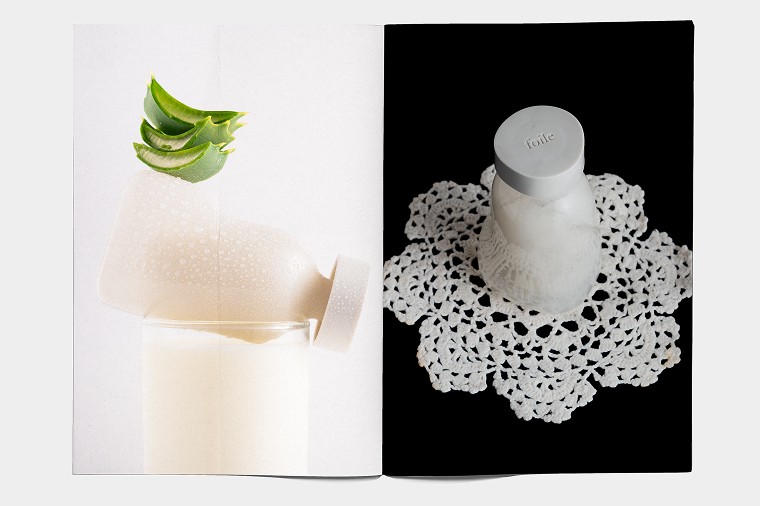
Colour plays a pivotal role, drawing from natural materials and the Australian landscape. Earthy browns, soft greens, and muted blues create a palette that feels both grounded and elevated—much like Emmi’s interiors. These tones don’t shout for attention; instead, they invite a sense of calm and longevity.
At the heart of the identity is the cross-stitch motif—a subtle nod to craftsmanship and the beauty of imperfection. Its pixel-like structure bridges the gap between handmade tradition and digital precision, reinforcing Emmi’s philosophy: spaces should be intuitive, liveable, and deeply personal.
The result? A brand that doesn’t demand attention but earns it through quiet confidence. Emmi Collective isn’t about trends; it’s about spaces—and identities—that stand the test of time.
Featured on The Brand Identity
Some brands feel effortless yet deeply considered, and that’s exactly the space Emmi Smith wanted Emmi Collective to occupy. As a design studio rooted in interior spaces, the challenge was to create an identity that felt referential yet contemporary—drawing from art, design, and nature without ever feeling overly conceptual.
Through close collaboration with Emmi, a clear direction emerged: a balance of refined aesthetics and liveable warmth. This duality informed every brand decision, from typography choices that bridge tradition and modernity to a visual language that feels as much about instinct as it does about precision.
The typography reflects this approach, balancing sculptural letterforms that bring a sense of heritage and sophistication with a softer, more humanistic counterpart that introduces warmth and approachability. Set in all caps for impact or sentence case for fluidity, the typography enhances Emmi Collective’s quiet confidence.
Colour plays a pivotal role, drawing from natural materials and the Australian landscape. Earthy browns, soft greens, and muted blues create a palette that feels both grounded and elevated—much like Emmi’s interiors. These tones don’t shout for attention; instead, they invite a sense of calm and longevity.
At the heart of the identity is the cross-stitch motif—a subtle nod to craftsmanship and the beauty of imperfection. Its pixel-like structure bridges the gap between handmade tradition and digital precision, reinforcing Emmi’s philosophy: spaces should be intuitive, liveable, and deeply personal.
The result? A brand that doesn’t demand attention but earns it through quiet confidence. Emmi Collective isn’t about trends; it’s about spaces—and identities—that stand the test of time.
Featured on The Brand Identity
Services
Services
Brand Identity
Brand Identity
Tone of Voice
Tone of Voice
Client
Client
Emmi Smith
Emmi Smith
Year
Year
2025
2025