


Info
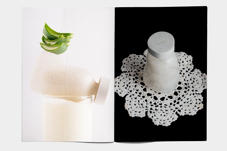
For Adaptual Health’s Remedy Blends range, we aimed to design packaging that reflected the brand’s refined aesthetic while staying true to the essence of each product. The concept was simple: create a tactile, luxurious experience that spoke to the quality of the blends and the brand’s attention to detail.
We envisioned embossing a unique symbol for each blend onto its tuckbox, adding a physical element of sophistication and creating a connection between the product and its purpose. While printing constraints meant we couldn't implement the embossing right away, it remains a key part of the future vision for the packaging.
The color palette was chosen to evoke the healing properties of each blend without resorting to overly earthy or cliché tones. Instead, we went for an elegant, sophisticated look that feels modern and approachable. This approach aligns with Adaptual Health’s commitment to holistic wellness, proving that a brand can be both mindful and stylish.
Every design decision was intentional, from the symbolism of the packaging to the colors and finishes, ensuring that the Remedy Blends range reflects Adaptual Health’s philosophy of elevated wellness.
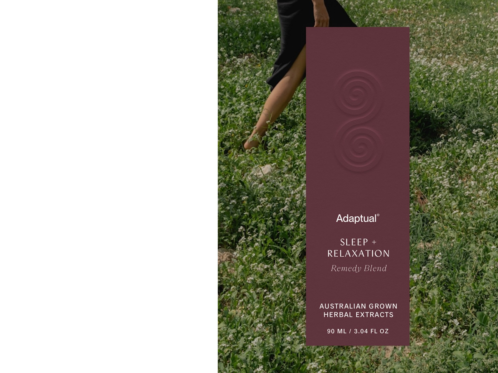
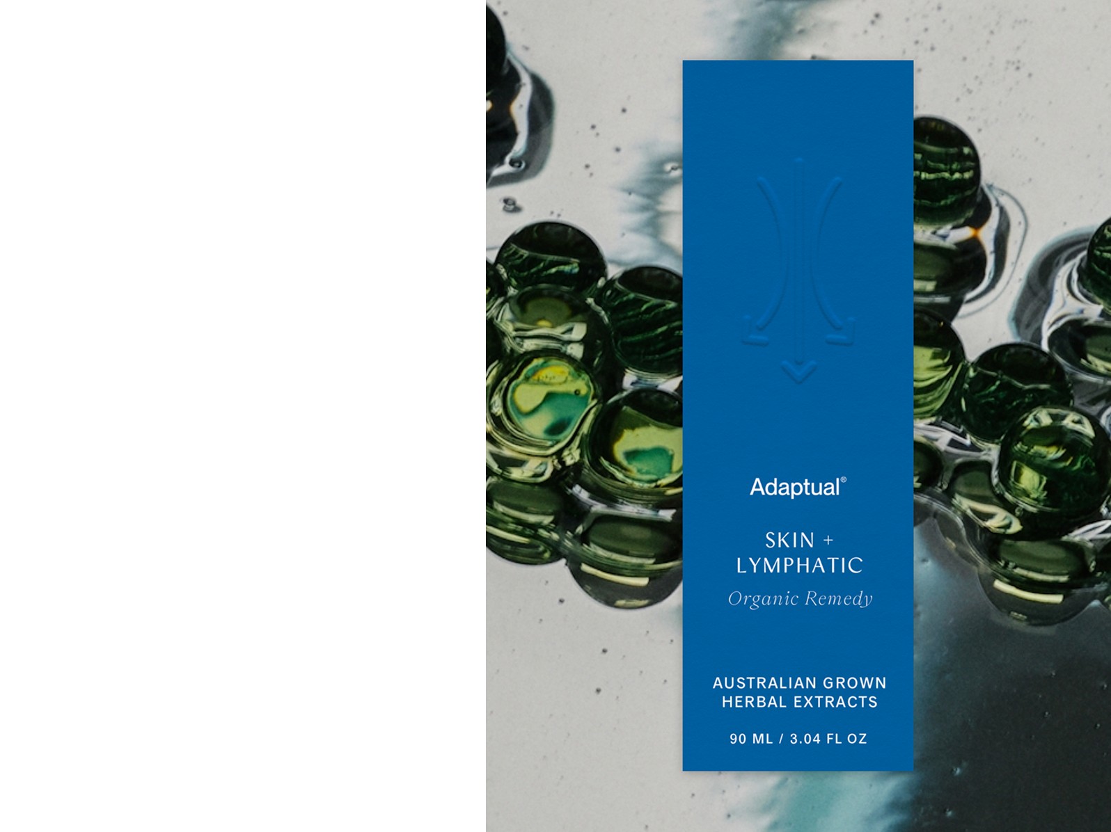
Services
Services
Packaging Design
Packaging Design
Client
Client
Adaptual Health
Adaptual Health
Year
Year
2024
2024